Cash flow, Sankey, saved reports
The Reports page: one filter bar over cash flow, spending, income and net worth, the Sankey from paychecks to categories, the transaction list under every chart, and saving a report.
Updated September 5, 2026 · 2 min read
Reports shows where the money went, to the cent, and lets you drill from any chart to the transactions behind it. One filter bar serves four tabs.
The filter bar
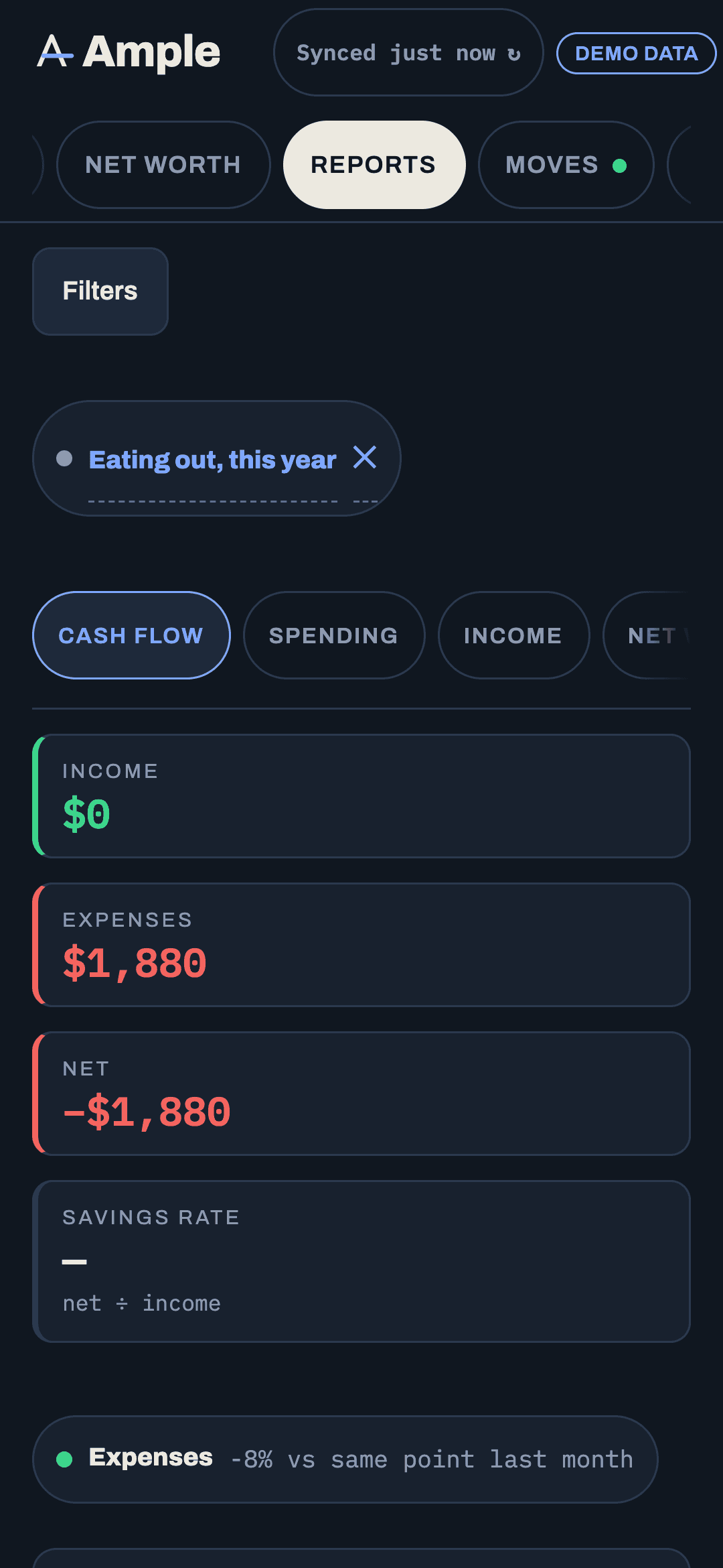
Date presets (this month, last month, last 3 / 6 / 12 months, year to date, last year, custom), accounts, categories, groups, buckets, merchants, an amount range, and three toggles: transfers out (default on), interest & fees out (default on), hidden accounts (default off). Active filters appear as pills you can remove with a tap.
Transfers, including card payments and moves into savings, are excluded by default so nothing counts twice. Interest is a debt cost, shown under Debts, not as spending here.
Cash flow
Income, expenses, net and savings rate for the period, with change against the prior period. A bar chart by month, quarter or year. And the Sankey: paychecks and other income on the left flowing into buckets, then groups, then categories, with a "Left over" band when income exceeds spending. Hover for amounts; tap a node to filter the list under the chart to it. On a phone the Sankey shows two levels.
Spending
A donut with a legend in dollars and percent, grouped by category, group or merchant. Change over time stacks the top six over the period. A fixed · flexible · non-monthly split shows what share of spending is committed. Tap a slice or a legend row to filter the list.
Income
Paychecks by month with a count pill (2 or 3), other income separately, three- and twelve-month averages, the trend, and the Payroll badge naming the employer deposits Ample classed as income.
Net worth
Assets and liabilities stacked with the net line, a toggle between the Adjusted home value and the purchase appraisal, a breakdown by account type, and projection milestones as chips.
The list under every chart
Every chart has the exact transactions that made it in a table you can sort, select for bulk edits, and download as CSV, with a summary (count, largest, average, total in and out). If a number on a chart looks wrong, the list is where you find the transaction to fix.
Saved reports
Set the filters and the tab you want, then Save report and name it. Saved reports list as chips in the header and reopen with one tap, filters and tab included. "Year of spending," "Dining, last 3 months," "Income, this year" are typical. They are yours, stored with your settings, and included in your data export.
Totals that reconcile
For the same period and filters, the Spending total equals the month's spend on Budgets, the list equals the Transactions tab, and the Sankey's inflow equals the income total. If two numbers disagree, a transfer or an interest charge is probably toggled differently; the toggles are the usual explanation.
Still stuck?
Tell us what you were trying to do and what happened. A person reads every message.
Contact support